
Creating a digital dashboard with Airtable that does not break itself
About a week ago, I sat down to rebuild a client reporting dashboard inside Airtable — something I swore I’d done a dozen times before, except this time, the dropdown filters weren’t… dropping down. And that was just the start ¯\_(ツ)_/¯
Let me walk you through what actually worked and what surprised me. If you’ve tried to grab charts from the Interfaces tab and ended up with blank widgets and triggers firing out of order — same. You’re in the right place.
1. Starting with the right Airtable base structure
So the first thing nobody tells you before you build an Interface is that your base has to be weirdly clean. Tried dragging a Vega-Lite chart into an interface panel using a field that I thought had consistent labels — turns out, three records had trailing spaces in the Status column and that broke the entire chart.
If your base has more than one linked table per record, like a many-to-many Clients-to-Projects setup, you have to get ruthless about rollups. I had a table called Worklogs linked to Projects, but forgot to add a formula in Projects summarizing billable hours. That was a huge problem because later in the dashboard, I was trying to show billable totals per project, but the field didn’t even exist 😐
Here’s what ended up working:
- Added two formula fields: one for clean labels (TRIM(Status)) and another for month grouping (DATETIME_FORMAT(work_date, ‘YYYY-MM’))
- Created one rollup per numeric value I needed charted (using SUM(values)) — Airtable doesn’t calculate on-the-fly in the dashboard otherwise
- Made sure field names didn’t include special characters because I had several calculations fail silently when referencing something like ‘Client (Tier A) Revenue’
You don’t notice this stuff until you’re halfway through the Interface Designer… then something silently renders as a blank screen and you’re like “Wait, that chart needs a lookup field available in another view I never created.” 🙃
2. Building an Interface with actual usable filters
Okay so Airtable’s Interface Designer promises “dashboard filter dropdowns,” and yeah, technically they exist, but you have to jump through hoops to make them useable.
Let’s say you want your dashboard user to be able to filter by Project Manager. That dropdown has to point to a single select, linked record, or user field — AND the filtered views or widgets must SOURCE directly from that same field.
I picked the wrong field type (a formula) when trying to represent PMs. So even though the data looked fine, the filter dropdown had zero effect. Nothing told me this, of course. I only figured it out by switching the underlying field to a real linked record type.
Also — and this is wild — if you place the filter above the widgets, the chart inherits the filter. If you add a filter below, nothing happens. No warning, no error. Just a beautiful line chart representing the entirety of the data despite you choosing “Only show records for PM: Sarah.”
The filter placement order is more about rendering logic than hierarchy. I learned this the dumb way by clicking around for 40 minutes wondering why my multi-project charts weren’t changing.
Some quick tricks:
- Always test your filters on a filtered grid before setting up your chart — that way, you know whether Airtable respects it
- Red fields in Interface = Airtable can’t read them, usually due to type mismatch
- You can duplicate filters by alt-dragging — which saves you if you want similar filters on different widgets, but Airtable still won’t let you “mirror” one filter across the whole dashboard
Wish Airtable would just explain this more clearly, instead of making filter logic feel like spelunking through an escape room.
3. Making charts that do more than just look cute

So the built-in chart elements in Airtable Interfaces are okay if you want a line or bar chart. But the options are surprisingly rigid. Like, I had a dataset sliced by month and project type… and there was no combo chart option. Just line or bar. Not even grouped bars.
To show reportable metrics like % completed projects vs active ones per PM, I ended up doing math in the base first, using formula + rollup fields. Then threw that into a bar chart sorted by descending value. I tried to invert the axis (so the biggest bar was at the top) but nah — no axis inversion.
Here’s the kicker: if your Labels field contains duplicate values, the chart compresses them and shows just one bar. I wanted to show values per month, but had inconsistent date formats in the original field (some were ’01-04-2023′ and others ‘Apr 1’). Solved it using a helper field:
DATETIME_FORMAT({Due Date}, 'YYYY-MM')That fixed the bar grouping, but I still couldn’t do stacked bars. So instead, I created two different charts, lined them up, and pretended they were part of the same widget. 😂
Also, Airtable won’t give you fine-grain number formatting — you get commas or you don’t. No custom currency signs. I had to prefix my formula field with “\$” just to fake it.
4. Sharing dashboards without accidentally granting base access
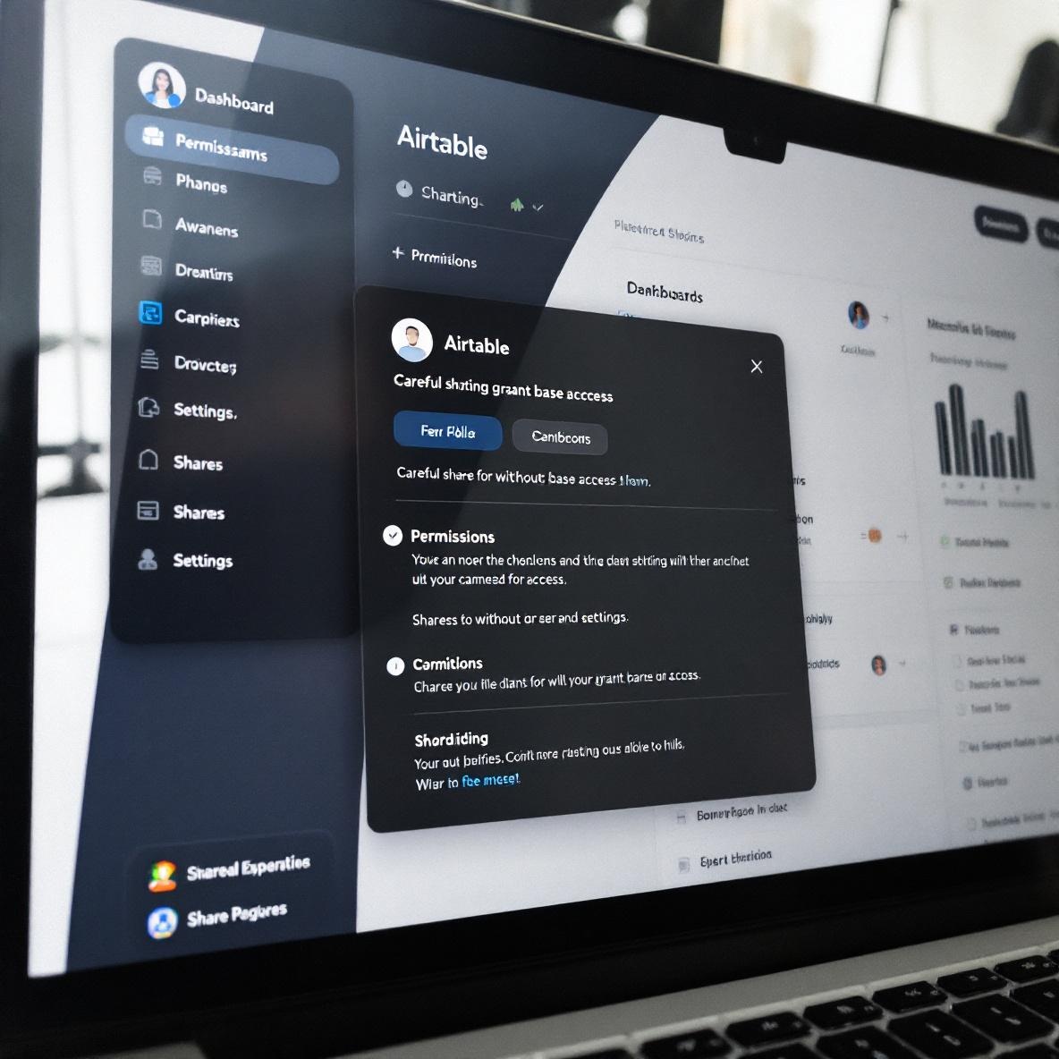
This one made my heart skip: I shared an Interface via a private link to a finance lead, thinking it was locked down. Nope. They could see raw data by clicking on related record links, and from there, access the entire table.
If the field is a linked record and the Interface element uses that linked record in a widget, the user can navigate backwards. I thought hiding the field would prevent that — lol no.
What I did eventually to contain the damage:
- Removed all linked field widgets and replaced them with formula fields that output text instead of relationships
- Hid all Tables except the one powering the Interface
- Under Share options, selected “Restrict access to this Interface only” (but Airtable hides this in a submenu, not visible unless you click into ‘Advanced’)
It’s basically security-by-omission. So think twice before sharing any dashboard link to someone outside your Airtable team.
Also worth knowing — the dashboard will show you stale data if someone else is editing a record in real time. I had a situation where a team lead changed two status fields but the dashboard still showed the previous values. Refresh did nothing until a full hard reload.
Not a great look during executive reviews 😐